Accessibility
Designing user interfaces for accessibility
Appian is committed to providing user interface features that allow the widest audience to benefit from applications built on the platform. The SAIL framework was designed with accessibility as a primary concern, with a goal of functional equivalence for users with low vision, limited dexterity, and other disabilities.
Learn more about the industry standards that guide our accessibility approach.
While many of SAIL's accessibility features are transparent—designers do not have to do anything special to benefit from them—a number of UI design choices do dictate the quality of experience for people with disabilities. The reference documentation for each interface component highlights relevant accessibility considerations. Also keep in mind the following best practices when designing for all users.
Always provide a text equivalent
Non-sighted or low-vision users rely on assistive technologies to translate visible UI content into text that is either read aloud or presented as Braille. UI elements that do not have a plain text representation cannot be communicated to these users. For example, an image that includes text will only be available to sighted users who can see the rendered screen.
Use the alternative text configuration to specify a text equivalent for images and icons; this text will not be shown on-screen but will be made available to screen readers. While decorative images without a text equivalent are permissible, crucial data and controls should be expressed with text.
Avoid relying on color to communicate information
Color is a useful supplemental technique to help some users comprehend information. For instance, the positive rich text style shows data in green to suggest a gain or success. However, users with limited vision or those with certain types of color blindness would not benefit from this differentiation. Never assume the ability to identify colors in order to complete a task. For example, instructions to "Click the red button to continue" would not be accessible.
For users with low vision, there is an Accessibility option in User Settings where they can enable fill patterns on column, bar, and pie charts.
Explicitly describe form inputs
Accessibility is automatically optimized when using the label, instructions, and validation message configurations of interface inputs. The framework takes care of letting screen reader users know the relevant description of the currently-focused field. However, accessibility may suffer when a designer relies solely on the visual representation of a rendered screen to make a form comprehensible. For example, close proximity of instructions to an input on-screen may help a sighted user fill out the form correctly, but a visually-impaired user would not benefit from that context unless the information is explicitly associated with the field.
Even when choosing not to show a visible field label on-screen, designers can use the "Hidden" label position to make label text available only to screen reader users.
Use accessible headers
Box labels, section labels, and rich text headers help users understand the structure of information on a page. Although colors, styles, and sizes for rich text items may be used to mimic the appearance of a header, screen readers will not interpret such styled text as section headers that represent the structure of page content.

Use sections, boxes, and rich text headers to clearly outline page structure
Don't use rich text items to mimic the appearance of a header.
Use section labels and the "Accessibility Heading Tag" parameter to ensure screen readers properly announce page structure. The accessibility heading tag allows screen reader users to understand how content is organized on a page and to easily navigate between different sections.
By default, section labels map to the following:
| Section Label Size | Accessibility Heading Tag |
|---|---|
| Extra Large | H1 |
| Large | H1 |
| Medium Plus | H2 |
| Medium | H2 |
| Small | H3 |
| Extra Small | H4 |
Depending on the hierarchy of sections on the page, the section label sizes and default heading tags may not be representative of your page organization. For example, if you have a section using an "Extra Large" label and a nested section using a "Large" label, the accessibility heading tag for the "Large" label should be changed from H1 to H2. Make sure that your section label heading tags accurately represent page structure using the proper H1 through H6 values.
Use accessibility text to provide supplemental information
The "Accessibility Text" parameter allows designers to specify text on a field or layout that will be read by screen readers in addition to the label and instruction text.
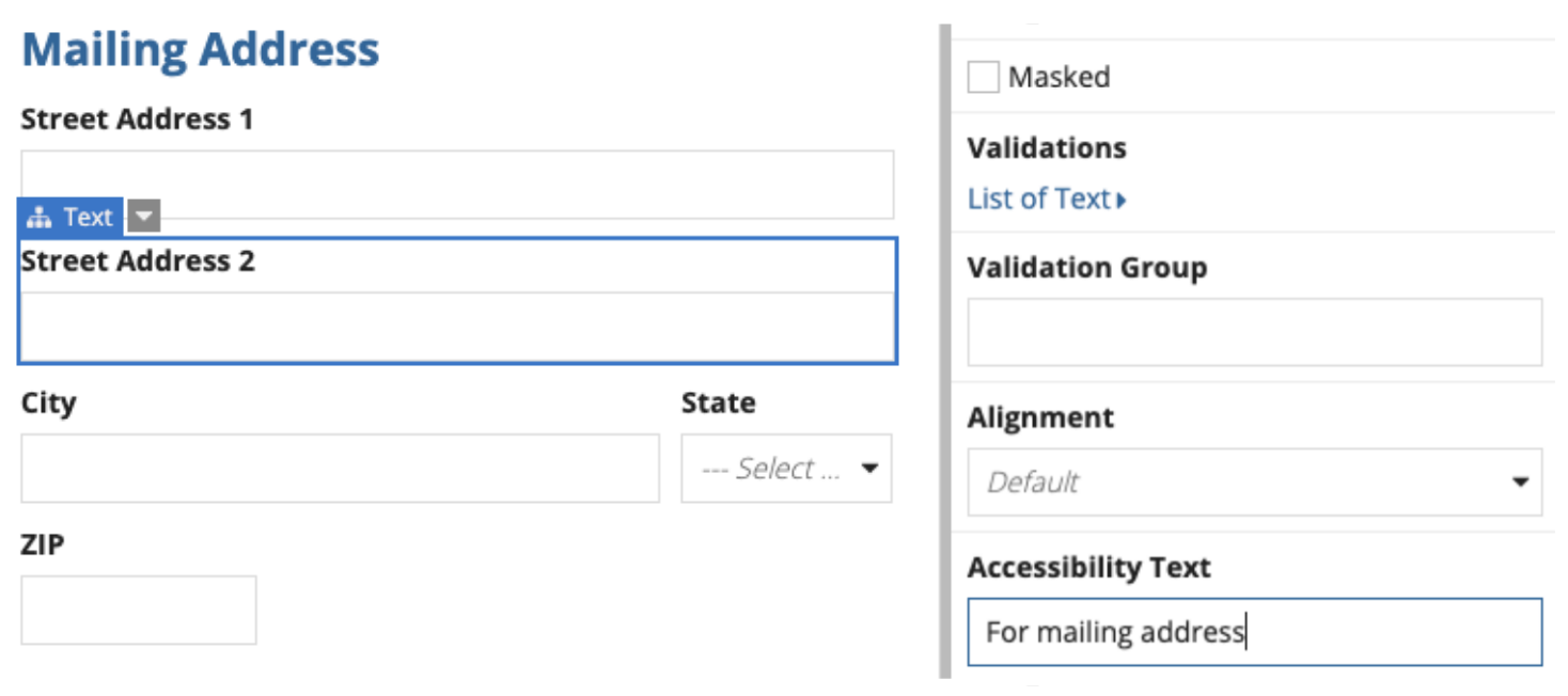
For example, consider a form with "Mailing Address" and "Shipping Address" sections. A sighted user will have the benefit of seeing the corresponding section label in close proximity while filling out each field. But, a screen reader user may benefit from a more direct reminder of the current section.
By specifying "For mailing address" as the accessibility text for the "Street Address 2" field, a screen reader will read out, "Street Address 2, For mailing address" (the label followed by the accessibility text).