a!gridColumn( label, sortField, helpTooltip, value, showWhen, align, width )
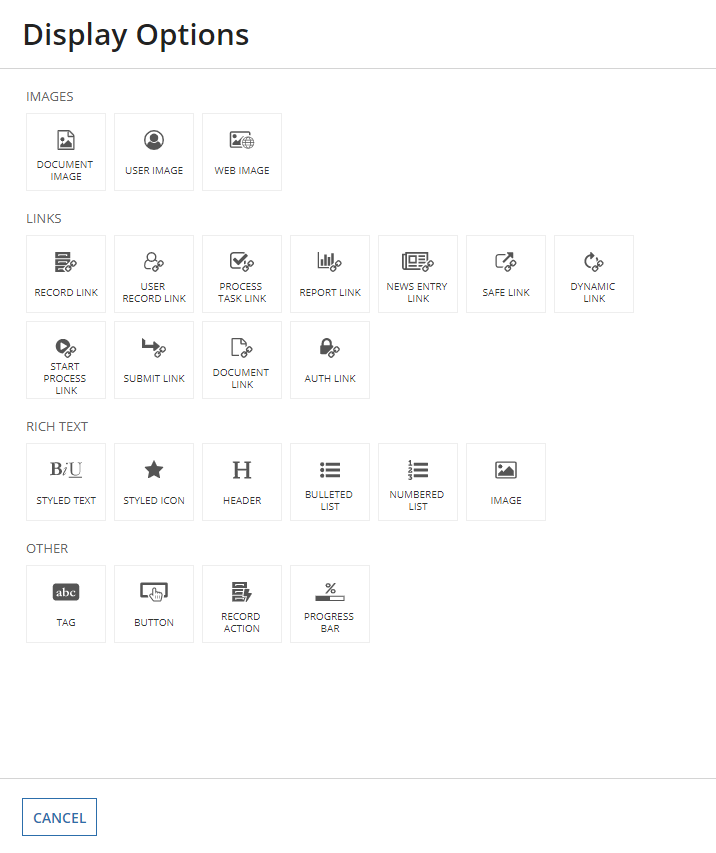
Displays a column of data as read-only text, links, images, rich text, buttons, tags, record actions, or progress bars within the Read-Only Grid Component.
When configuring the component, click Display Options after choosing a value.
See also: Grids design guidance
| Name | Keyword | Types | Description |
|---|---|---|---|
|
Label |
|
Text |
Text to display as the column header. |
|
Sort Field |
|
Any Type |
The field used to sort the grid when selecting this column header. Grids that use record data must use the |
|
Help Tooltip |
|
Text |
Displays a help icon in the column header with the specified text as a tooltip. |
|
Display Value |
|
Any Type |
The value to display in each cell within the column. The value can be text, |
|
Visibility |
|
Boolean |
Determines whether the column is displayed in the grid. When set to false, the column is hidden and is not evaluated. Default: |
|
Alignment |
|
Text |
Determines the alignment for the header label and all values within the column. Valid values: |
|
Width |
|
Text |
Determines the column width. Valid values: |
"AUTO" width, the width is determined by the length of the longest unbroken value in that column.
"AUTO" and weighted column widths (such as "1X", "2X", "3X", etc) together."NARROW", "MEDIUM", etc) for a column that doesn't take up the width of the page, the width will auto distribute depending on the content inside the column."ICON" & "AUTO" widths together, the column using "ICON" will always be the same width and the column using "AUTO" will fill up the remaining space.| Feature | Compatibility | Note |
|---|---|---|
| Portals | Compatible | |
| Offline Mobile | Compatible | |
| Custom Record Field Expressions | Incompatible | |
| Process Reports | Incompatible | You cannot use this function to configure a process report. |
| Process Events | Incompatible | You cannot use this function to configure a process event node, such as a start event or timer event. |
There are older versions of this interface component. You can identify older versions by looking at the name to see if there is a version suffix. If you are using an old version, be sure to refer to the corresponding documentation from the list below.
| Old Versions | Reason for Update |
|---|---|
| a!gridImageColumn | Now supports multiple interface components. |
| a!gridTextColumn | Now supports multiple interface components. |
To learn more about how Appian handles this kind of versioning, see the Function and Component Versions page.
The following patterns include usage of the Read-Only Grid Column Component.
Aggregate Data and Conditionally Display in a Chart or Grid (Reports, Charts, Query Data, Grids, Records): Aggregate data and conditionally display it in a pie chart or grid. In this pattern, we will calculate the total number of employees in each department and display it in a pie chart and a read-only grid. Then, we'll use a link field to conditionally display each component.
Conditionally Hide a Column in a Grid (Grids, Conditional Display): Conditionally hide a column in a read-only grid when all data for that column is a specific value.
Configure a Chart Drilldown to a Grid (Charts, Grids, Query Data, Records): Displays a column chart with aggregate data from a record type and conditionally shows a grid with filtered records when a user selects a column on the chart.
Configure a Chart to Grid Toggle (Charts, Grids): Display a column chart with a toggle to display an alternate grid view of the data.
Delete Rows in a Grid (Grids): Delete one or more rows of data in a read-only grid.
Display Last Refresh Time (Auto-Refresh, Grids, Records): Display the last time the interface was updated, either based on a user interaction or a timer.
Display Processes by Process Model with Status Icons (Grids, Images, Reports): Use an interface to display information about instances of a specific process model.
Display a User's Tasks in a Grid With Task Links (Grids, Reports, Looping): Display the tasks for a user in a Read-Only Grid and allow them to click on a task to navigate to the task itself.
Drilldown Pattern (Grids): The drilldown pattern allows users to select an item from a grid to see more details in place of the grid.
Drilldown Report Pattern (Grids, Charts, Reports): The drilldown report pattern consists of a bar chart and column chart, which each drill down into a grid.
Filter the Data in a Grid (Grids, Filtering, Records): Configure a user filter for your read-only grid that uses a record type as the data source. When the user selects a value to filter by, update the grid to show the result.
Filter the Data in a Grid Using a Chart (Charts, Grids, Filtering, Records): Display an interactive pie chart with selectable sections so that a user may filter the results in a grid.
Grid With Detail (Grids): The grid with detail pattern allows users to select an item from a grid to see more details next to the grid.
Grid with Selection Pattern (Grids): This pattern is an example of good UX design for a grid that allows users to select items and easily view their selections when there are multiple pages of data. It also provides information on a common save behavior.
Limit Grid Selection to One Row (Validation, Grids, Records): Limit the number of rows that can be selected to one.
Limit the Number of Rows in a Grid That Can Be Selected (Validation, Grids, Records): Limit the number of rows that can be selected to an arbitrary number.
More-Less Link (Grids, Rich Text): Use this pattern to keep grids with rows containing varying text lengths looking clean and uniform. This design also improves readability and the user experience by limiting the amount of text in the interface.
Refresh Data Using a Refresh Button (Auto-Refresh):
Save a User's Report Filters to a Data Store Entity (Grids, Smart Services, Filtering, Reports): Allow a user to save their preferred filter on a report and automatically load it when they revisit the report later.
Searching on Multiple Columns (Grids, Filtering, Reports): Display a grid populated based on search criteria specified by end users.
Show Calculated Columns in a Grid (Formatting, Grids, Records): Display calculated values in columns in a grid.
Task Report Pattern (Grids, Filters, Process Task Links, Task Reports): Provides a simple way to create and display an Appian task report.
Top Customers and Their Latest Order (Records, Reports, Grids): This pattern illustrates how to create a grid that shows the top paying customers, their latest order, and their total sum of sales.
Use Links in a Grid to Show More Details and Edit Data (Grids): Allow end users to click a link in a read-only grid to view the details for the row, and make changes to the data. The data available for editing may include more fields than are displayed in the grid.
Use the Write to Data Store Entity Smart Service Function on an Interface (Smart Services, Grids, Looping): Allow the user to publish several rows of data to a table through the a!writeToDataStoreEntity() smart service function.
