
Tip: Interface patterns give you an opportunity to explore different interface designs. Be sure to check out How to Adapt a Pattern for Your Application.
GoalCopy link to clipboard
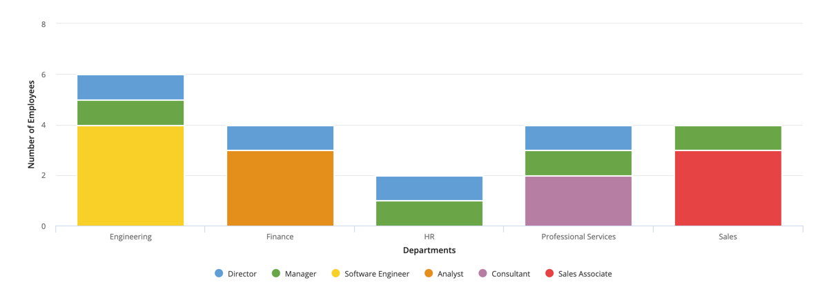
Aggregate data by multiple fields and display it in a stacked column chart. In this pattern, we will calculate the total number of employees for each title in each department and display it in a stacked column chart.
Note: This expression uses direct references to the Employee record type, created in the Records Tutorial. If you've completed that tutorial in your environment, you can change the existing record-type references in this pattern to point to your Employee record type instead.

This scenario demonstrates:
- How to aggregate data by multiple fields and display in a column chart.
Create this patternCopy link to clipboard
You can easily configure a chart in design mode when you use a record type as the source.
To create this pattern in design mode:
- Open a new or empty interface object.
- From the PALETTE, drag a Column Chart component into the interface.
- From Data Source, select RECORD TYPE and search for the Employee record type.
- Under Primary Grouping, select the
departmentfield. - Click ADD GROUPING.
- Under Secondary Grouping, select the
titlefield. - Under Measure, use the dropdown to select Count of, then select the
idfield. - From Stacking, select Normal.
- For the X-Axis Title, enter Department.
- For the Y-Axis Title, enter Number of Employees.
Your resulting expression will look something like this:
1
2
3
4
5
6
7
8
9
10
11
12
13
14
15
16
17
18
19
20
21
22
23
24
25
26
27
28
29
30
31
32
  a!columnChartField(
    data: recordType!Employee,
    config: a!columnChartConfig(
      primaryGrouping: a!grouping(
        field: recordType!Employee.fields.department,
        alias: "department_primaryGrouping"
      ),
      secondaryGrouping: a!grouping(
        field: recordType!Employee.fields.title,
        alias: "title_secondaryGrouping"
      ),
      measures: {
        a!measure(
          function: "COUNT",
          field: recordType!Employee.fields.id,
          alias: "id_count_measure1"
        )
      },
      dataLimit: 100
    ),
    label: "Column Chart",
    xAxisTitle: "Department",
    yAxisTitle: "Number of Employees",
    stacking: "NORMAL",
    showLegend: true,
    showTooltips: true,
    labelPosition: "ABOVE",
    colorScheme: "CLASSIC",
    height: "MEDIUM",
    xAxisStyle: "STANDARD",
    yAxisStyle: "STANDARD"
  )
Copy
Test it outCopy link to clipboard
- Hover over each of the stacked department data to see a breakdown of the title of employees in that department.