Inputs
Radio buttons
Use a radio button group to provide users with a short (<5 items) list of choices from which they must select one.
Because radio buttons cannot be deselected, one of the options should always be selected by default. Select the most desired or frequently selected option as the default value.
If users need to be able to not select any option, use checkboxes instead. Also consider using a single checkbox, instead of "Yes" and "No" radio buttons, for Boolean toggles.
Use the "Cards" style to give your choices more visual prominence and your users a larger click target.
The "Compact" layout option should only be used for radio button groups containing short choice labels that are not likely to wrap onto the next line, such as "Yes", "No", or "Maybe". When using the "Compact" layout, labels with text longer than 2 lines will be truncated. For long labels, use the "Stacked" layout.
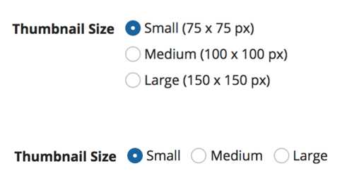
Examples of radio buttons with the "Standard" style using both "Stacked" and "Compact" layouts
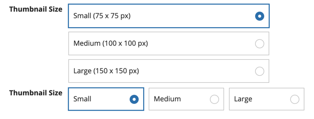
Examples of radio buttons with the "Cards" style using both "Stacked" and "Compact" layouts
Checkboxes
Use a checkbox group to provide users with a short (<5 items) list of choices from which none, one, or many items may be selected.
Use a single checkbox to provide users with a Boolean toggle. Always include a choice label.
Use the "Cards" style to give your choices more visual prominence and your users a larger click target.
The "Compact" layout option should only be used for checkbox groups containing short choice labels that are not likely to wrap onto the next line, such as "Yes", "No", or "Maybe". When using the "Compact" layout, labels with text longer than 2 lines will be truncated. For long labels, use the "Stacked" layout.
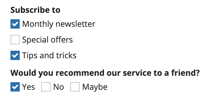
Two examples of checkboxes with the "Standard" style. The first is a "Stacked" layout showing subscription options and the second is a "Compact" layout showing recommendation options.
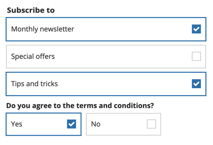
Two examples of checkboxes with the "Cards" style. The first is a "Stacked" layout showing subscription options and the second is a "Compact" layout showing terms and conditions agreement options.
Dropdowns
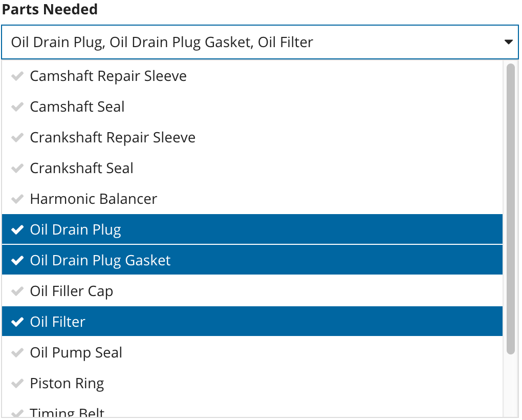
Use a dropdown to create moderately long lists of choices from which users can select one or many.
Use radio button groups, checkbox groups, or card choices for shorter lists, so that the user can easily see all choices.
Sort dropdown lists in a logical order, such as alphabetical.
If your dropdown list is too long to easily browse, use pickers so that users can search.
Card choices
Use card choices as a more visually engaging alternative to other input choices, like radio buttons or checkbox fields.
Use card choices to create a short list of choices from which users can select one or many. If your list of card choices is too long to easily browse, consider using a picker or dropdown.
Sort card choices in a logical order. For lists of response options (like yes, no, no opinion), sort or group them in order of intention. Otherwise, sort lists in a logical order, such as alphabetical order.
For a uniform and professional UI, make sure that you have consistent values for the icon, primary text, and secondary text fields for all card choices on an interface. For example, all card choices should include primary text, or none of them should.
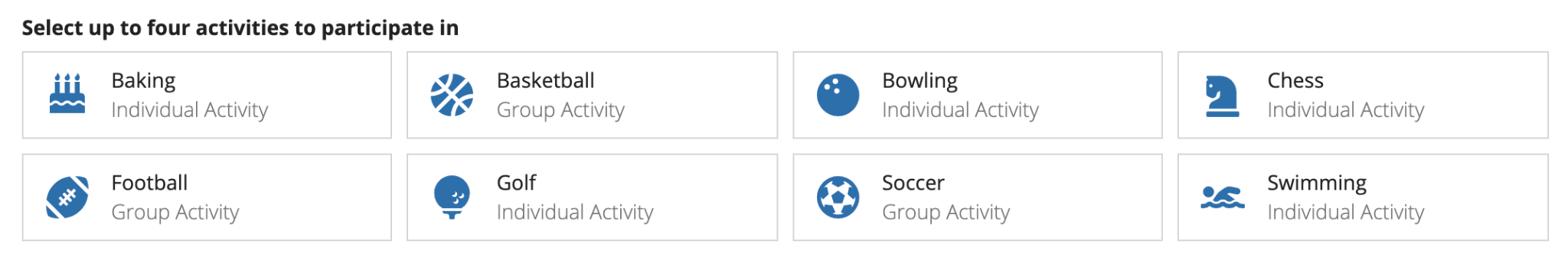
Use consistent parameters for all card choices options
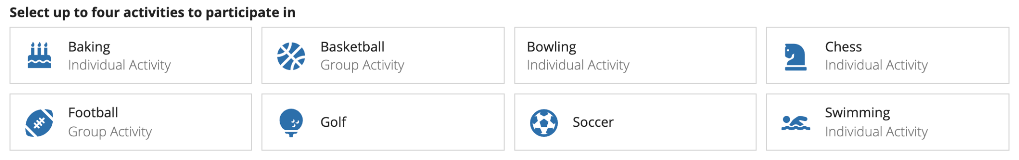
Don't mix data so that some have values for all parameters and others don't
Our templates are designed so that you can quickly and easily make visually impressive and well organized interfaces. Use the template that best fits your data and will best capture your users' attention. Each template fits data differently and works best in different UIs. The card tile template works best for a simple form or wizard step where you are completing one question at a time. The card bar templates are denser and work better inline on forms.
Text inputs
Choosing which text input to use
When designing interfaces that require text inputs, it's important to choose the right component for the specific use case. There are three types of text input components, each suited for different needs:
- For short text inputs: Use the text field for more concise entries, such as names, addresses, or single-line answers.
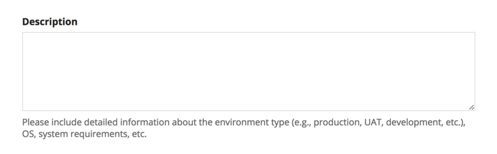
- For longer text inputs: Use the paragraph field where users would need to enter more text, like descriptions, comments, or multi-line responses.
- If users might want to format their text: Use the styled text editor to allow users to format their text, such as applying bold, italics, or lists.
If users don't need to style their text, using a styled text editor component may introduce unnecessary complexity and clutter to an interface. If you know users will not need to style their text, use a paragraph component to help maintain a clean and simple page design.
If you know you will need to eventually display a longer text input value in the grid, instead of a styled text editor component, consider using a paragraph component to collect the user's input. By default, displaying the value from a styled text editor component in a grid includes the HTML tags used for formatting. In order to display the value in a grid, you need strip the HTML using stripHtml(). This removes all formatting so the text will display as one string with no line breaks or list items, which could affect the readability of the content. See the Styled Text Editor Component page for details.
Paragraph and styled text editor height
For the paragraph and styled text editor components, select the appropriate height based on the expected length of user inputs. Avoid heights that exceed the visible area, particularly in shorter dialogs.
For the styled text editor, ensure the bottom-right corner of the editor is visible. This helps users keep the size limit validation in view.
For the paragraph component, in editable grids use the "Short" paragraph height to align the paragraph with the inputs in adjacent columns.
Show character limit count
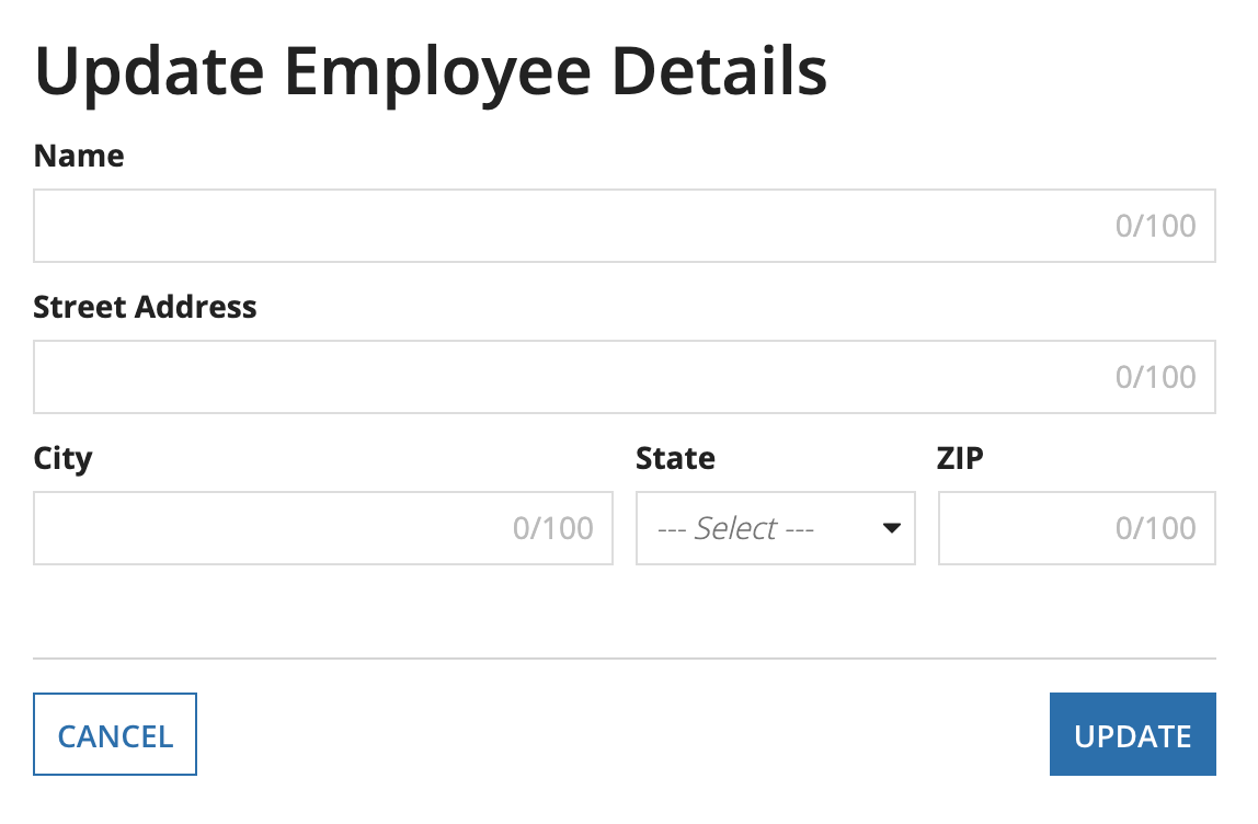
When using a character limit on a text or paragraph component, hide the character count if it is unlikely that users will exceed the character limit. This reduces clutter and distractions on the interface.
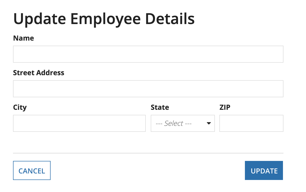
In this example, the Name, Street Address, City and ZIP fields all use the "Character Limit" parameter with "Show Character Limit Count" set to false. Users will see a validation when the character limit is reached, but will not see the character count in the text fields so that they are not distracted while filling out the form.
Displaying read-only styled text editor values
Consider distinguishing read-only styled text editor values from other formatted text, like component labels. The bold text in these values can be confused with component labels or bold rich text items.
Set read-only styled text editor values apart from other bold text elements on interfaces. This example uses a section and card layout, but you could also use something like white space or divider lines.
Instruction text
Use instructions to display important content that is essential to completing the task.
If the content should always be visible, use instructions as opposed to a help tooltip or placeholder.
Consider using instructions when a field label becomes too lengthy.
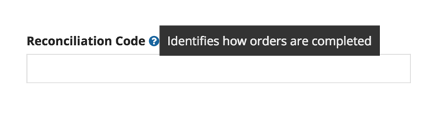
Help tooltips
Consider using a help tooltip instead of instructions for content that does not need be to read each time a user views the form.
For example, a help tooltip is appropriate for showing instructions that are most useful to new users.
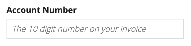
Placeholder text
Use placeholder text to describe the correct input format or provide a brief hint to assist with value input.
Placeholder text should not replace field labels.
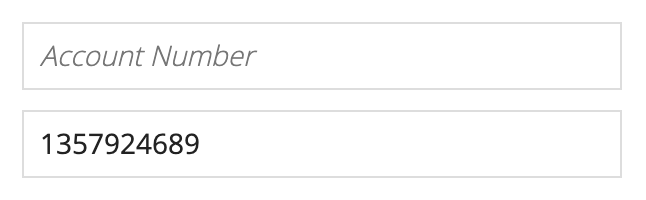
Note that whether placeholder text clears on focus or input varies by device and browser.
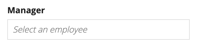
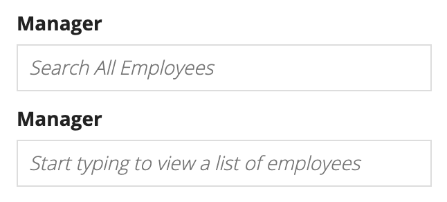
Picker placeholder text
Use placeholder text for picker components to provide a distinction from regular text inputs.
In general, use sentence case capitalization and keep the message as short as possible.
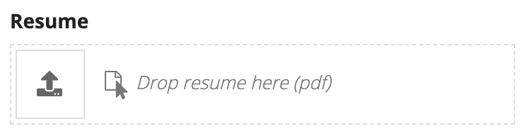
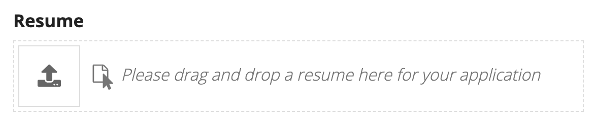
File upload placeholder text
The default placeholder text is "Drop files here." Use custom placeholder text to provide more detailed guidance to users.
In general, use sentence case capitalization and keep the message as short as possible.
Alignment
In left-to-right languages, use left alignment for inputs.