The a!iconIndicator() system function provides a convenient way for designers to access a library of typical indicator icons.
Icon size should be specified for indicator icons.
| System Icon | Name | Key | System Icon | Name | Key |
|---|---|---|---|---|---|
 |
Add | ADD |  |
Copy | COPY |
 |
Document | DOC_GENERIC |  |
Happy Face | FACE_HAPPY |
 |
Indifferent Face | FACE_INDIFFERENT |  |
Sad Face | FACE_SAD |
 |
Folder | FOLDER |  |
Harvey Ball 0/4 | HARVEY_0 |
 |
Harvey Ball 1/4 | HARVEY_25 |  |
Harvey Ball 2/4 | HARVEY_50 |
 |
Harvey Ball 3/4 | HARVEY_75 |  |
Harvey Ball 4/4 | HARVEY_100 |
 |
Move Down | MOVE_DOWN |  |
Move Down (Disabled) | MOVE_DOWN_DISABLED |
 |
Move Left | MOVE_LEFT |  |
Move Left (Disabled) | MOVE_LEFT_DISABLED |
 |
Move Right | MOVE_RIGHT |  |
Move Right (Disabled) | MOVE_RIGHT_DISABLED |
 |
Move Up | MOVE_UP |  |
Move Up (Disabled) | MOVE_UP_DISABLED |
 |
Preview | PREVIEW |  |
High Priority | PRIORITY_HIGH |
 |
Low Priority | PRIORITY_LOW |  |
Paused | PROGRESS_PAUSED |
 |
Running | PROGRESS_RUNNING |  |
Stopped | PROGRESS_STOPPED |
 |
Excellent Rating | RATING_EXCELLENT |  |
Fair Rating | RATING_FAIR |
 |
Good Rating | RATING_GOOD |  |
Poor Rating | RATING_POOR |
 |
Very Good Rating | RATING_VERYGOOD |  |
Remove | REMOVE |
 |
Remove (Disabled) | REMOVE_DISABLED |  |
Error | STATUS_ERROR |
 |
Not Done | STATUS_NOTDONE |  |
OK | STATUS_OK |
 |
Warning | STATUS_WARN |  |
Trend Down (Bad) | TREND_DOWN_BAD |
 |
Trend Down (Good) | TREND_DOWN_GOOD |  |
Flat Trend | TREND_FLAT |
 |
Trend Up (Bad) | TREND_UP_BAD |  |
Trend Up (Good) | TREND_UP_GOOD |
 |
Clock | WAIT_CLOCK |
The recommended dimensions for custom indicator icons are 40px (h) x 40px (w).
For proper visual balance, an icon shape of approximately 32 x 32px is recommended, centered within a transparent background.
Use solid colors and simple, recognizable shapes.
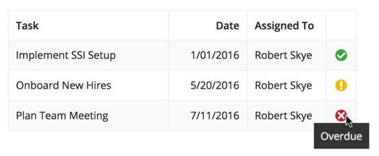
Use indicator icons as a concise representation of the state of items shown in a grid. The domain of possible icons should be small and well-known to users.
Make sure to provide an alternate text description of each icon for non-sighted users or users who don't recognize what an icon represents.
Indicator Icons
