Side by Side Layout
See the developer documentation for technical details about the side by side layout.
Weighted widths
By default, side by side layouts split the available space evenly. You can use weighted widths to assign a greater proportion of space to certain items in a layout.

The "First Name" and "Last Name" side by side items each have a weight of 4, so they take up 4x as much of the available width as the "M.I." field.
"Minimize" width
Use the "Minimize" width to allow a side by side item of a defined width to take up only as much space as necessary.
When using the "Minimize" width, the rest of the items in the layout will split the remaining space. To ensure that all available space is filled, we recommend that you do not use "Minimize" for every item in a layout.

Here, the "Minimize" width is applied to the avatar-style image, so that it takes up as much space as it needs. The rich text item to the right of the image takes up all of the remaining width. Shrinking the image size from "Large" (top) to "Small" (bottom) shows how the "Minimize" width automatically adjusts.
The "Minimize" setting works best for items with a defined width. Avoid using the "Minimize" setting for components that may change in width due to user interaction.
Items with defined widths
Items with a defined width are those that will remain the same width no matter what.
These include, but aren't limited to:
- Images with a fixed size, like "Medium"
- Static text values or links
- Buttons
- Tags
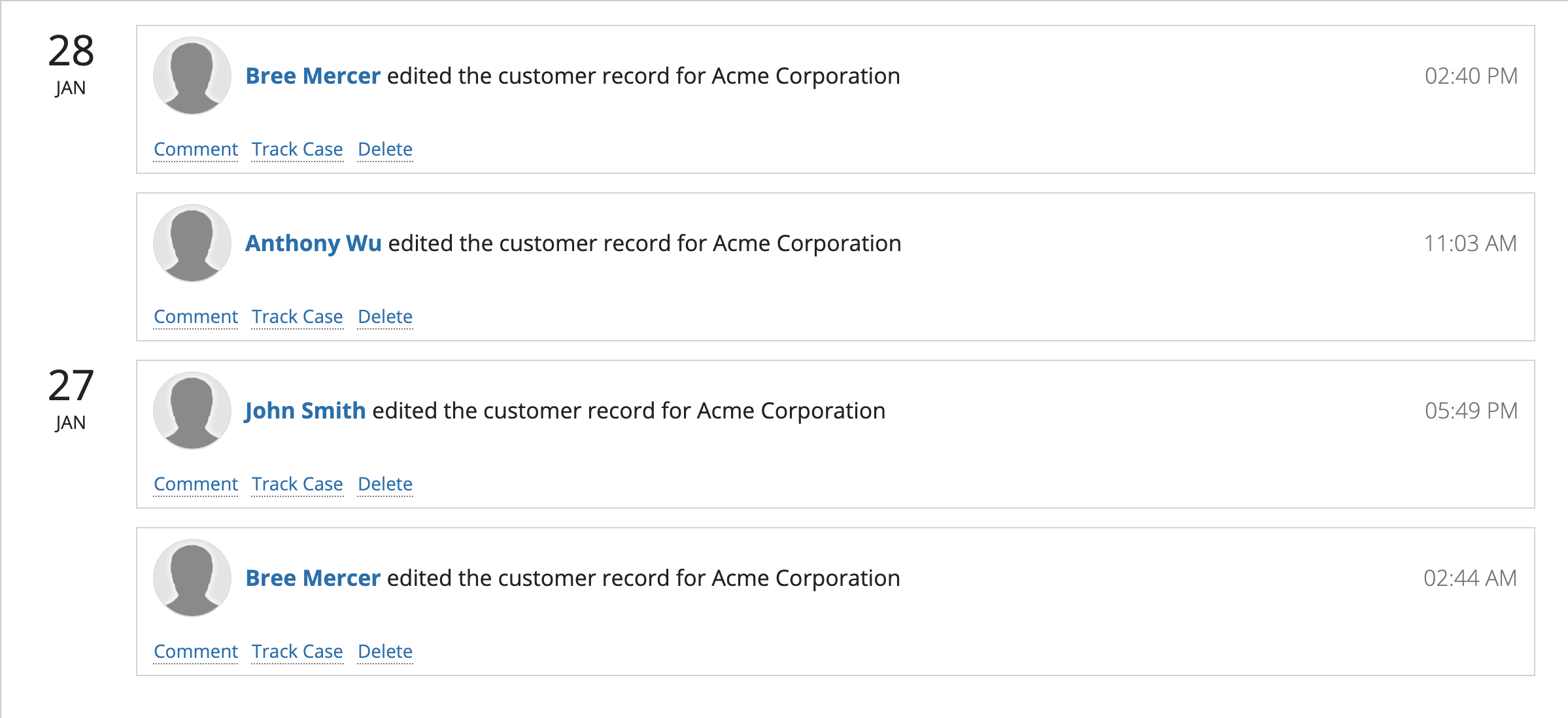
Use "Minimize" for short text links that won't change widths based on user interaction. In this example, the user image and time stamp are also defined widths and are using "Minimize" in order for the body text to have enough space.
Items without defined widths
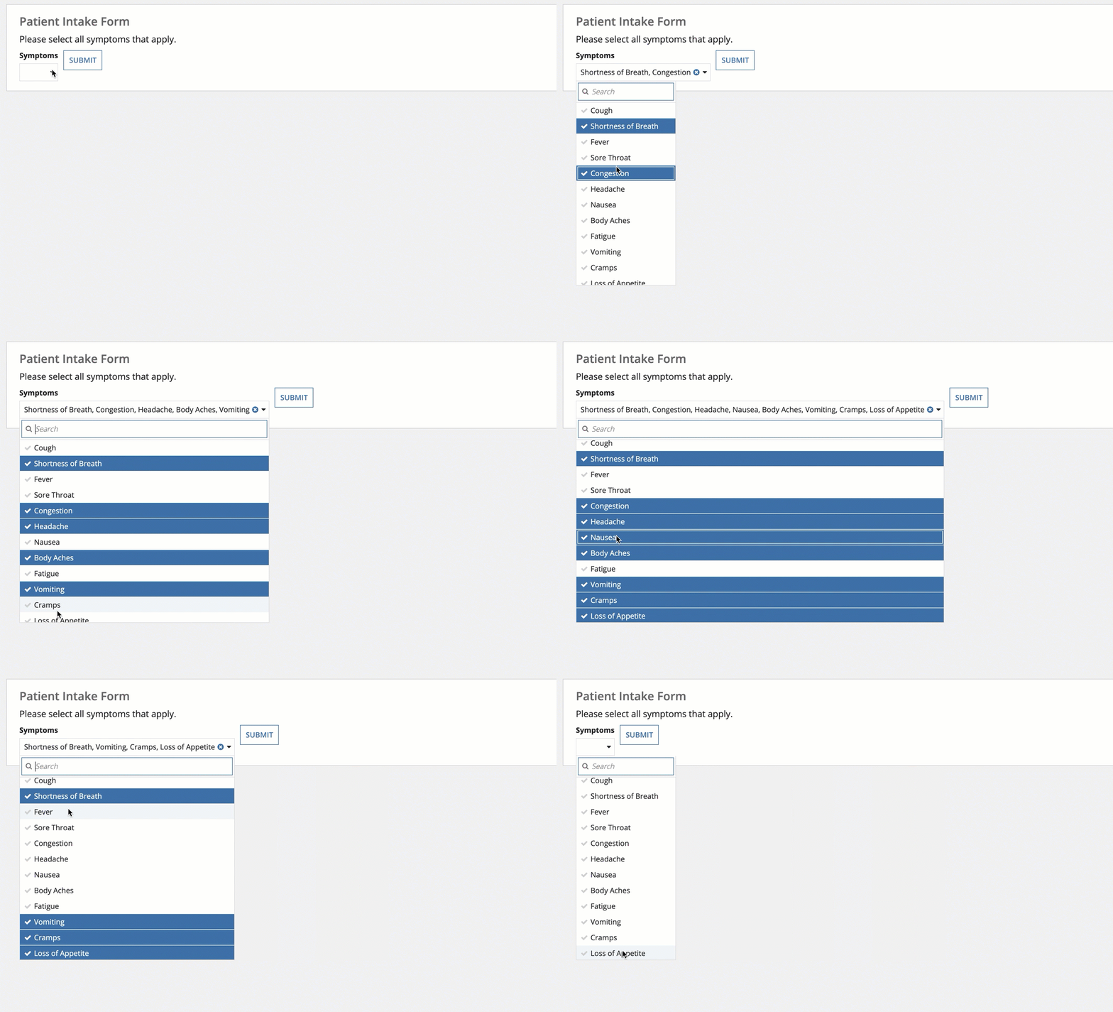
Items without a defined width are those that may change based on user interaction or window width.
These include, but aren't limited to:
- Images with an adjustable size, like "Fit"
- Dropdowns
- Pickers
- Text fields


