Tip: Interface patterns give you an opportunity to explore different interface designs. Be sure to check out How to Adapt a Pattern for Your Application.
The tabs patterns provide an ideal style and design for creating tabbed interfaces. This page explains how you can use this pattern in your interface, and walks through the design structure in detail.
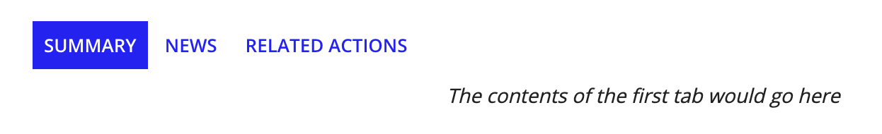
The tabs patterns is useful when you want to present different views of the same topic. This page explains how you can use the three types of tabs patterns available from the component palette, and walks you through the design structure of the regular tabs pattern in detail.
Tabs should reflect the structured organization of a topic. For example, when looking at a page about a customer, there might be tabs for "Projects", "Opportunities", and "Invoices". Users should not see completely different tabs when looking at different customers (though it is acceptable to omit tabs that are not applicable to the context).
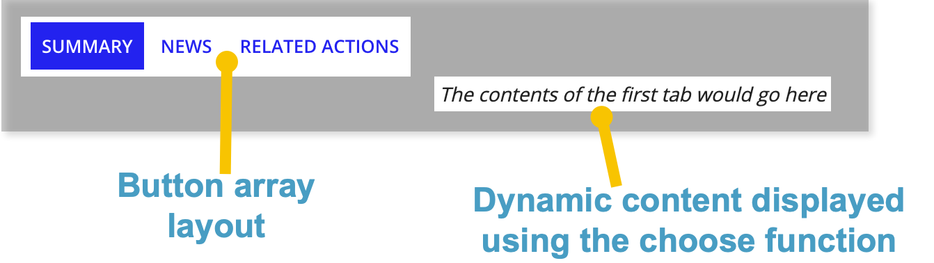
The main components in the tabs pattern are rich text display fields and a button array layout. The tabs (lightweight) pattern is similar to the regular tabs pattern, but uses rich text links instead of buttons. The image below displays how the pattern looks on a blank interface with callouts of the main components. You can examine the entire expression or jump down to the subsections below with referenced line numbers to see a detailed breakdown of the main components.
When you drag and drop the tabs pattern onto your interface, 58 lines of expressions will be added to the section where you dragged it.
At the top of the pattern, a local variable is used to set the default for the selected tab. Following the local variable is a button array layout with three button widgets representing each tab.
1
2
3
4
5
6
7
8
9
10
11
12
13
14
15
16
17
18
19
20
21
22
23
24
25
26
{
  a!localVariables(
    local!selectedTab: 1,
    {
      a!buttonArrayLayout(
        buttons: {
          a!buttonWidget(
            label: "Summary",
            saveInto: if(local!selectedTab = 1, {}, a!save(local!selectedTab, 1)),
            size: "SMALL",
            style: if(local!selectedTab = 1, "PRIMARY", "LINK")
          ),
          a!buttonWidget(
            label: "News",
            saveInto: if(local!selectedTab = 2, {}, a!save(local!selectedTab, 2)),
            size: "SMALL",
            style: if(local!selectedTab = 2, "PRIMARY", "LINK")
          ),
          a!buttonWidget(
            label: "Related Actions",
            saveInto: if(local!selectedTab = 3, {}, a!save(local!selectedTab, 3)),
            size: "SMALL",
            style: if(local!selectedTab = 3, "PRIMARY", "LINK")
          )
        }
      ),
After displaying the button components, we use the choose() function to allow users to change the tab views when clicking on them. The contents of each tab view are displayed in a rich text display field with placeholder text. You can easily replace it with a component or rule.
27
28
29
30
31
32
33
34
35
36
37
38
39
40
41
42
43
44
45
46
47
48
49
50
51
52
53
54
55
56
57
58
 {
        choose(
          local!selectedTab,
          {
            /* Replace this rich text with the component or rule that should populate this tab */
            a!richTextDisplayField(
              labelPosition: "COLLAPSED",
              value: {a!richTextItem(text: "The contents of the first tab would go here", style: "EMPHASIS")},
              align: "CENTER"
            )
          },
          {
            /* Replace this rich text with the component or rule that should populate this tab */
            a!richTextDisplayField(
              labelPosition: "COLLAPSED",
              value: {a!richTextItem(text: "The contents of the second tab would go here", style: "EMPHASIS")},
              align: "CENTER"
            )
          },
          {
            /* Replace this rich text with the component or rule that should populate this tab */
            a!richTextDisplayField(
              labelPosition: "COLLAPSED",
              value: {a!richTextItem(text: "The contents of the third tab would go here", style: "EMPHASIS")},
              align: "CENTER"
            )
          }
        )
      }
    }
  )
}
In addition to the Tabs pattern described above, the Tabs (Lightweight) and Tabs (Cards) patterns are also available in your interface. They're located in PALETTE, under the PATTERNS tab.
Use the Tabs (Lightweight) pattern to add a second level of navigation to a page, or to avoid adding buttons to a part of a page that already features other buttons.
When you drag and drop the Tabs (Lightweight) pattern onto your interface, 67 lines of expressions will be added to the section where you dragged it.
Use Tabs (Cards) if you want a top level tab styling that is distinct from other links in the UI. The Tabs (Cards) pattern works best when used with a header content layout.
When you drag and drop the Tabs (Cards) pattern onto your interface, 121 lines of expressions will be added to the section where you dragged it.
